Individual Performance Dashboard
Overview
This report is used to prepare team leaders and individuals for their monthly one-to-one meetings to discuss the individual's performance. You can use the monthly performance charts as a basis for one-to-one meetings with your staff members. The 12-month charts can be useful in less-frequent performance reviews such as annual appraisals.
It is important that the individual feels a sense of ownership about the data contained in this report. You should ensure that individuals see this information regularly and can understand and interpret it for themselves in a positive way to identify opportunities for improvement. Your role is to support and coach the individual and the information contained in this report is one tool to help with this.

Team
Month
Staff Member
View Report
|
This section compares the team members Productivity, Utilisation and Attendance to the team for the selected month and to the team members previous month.
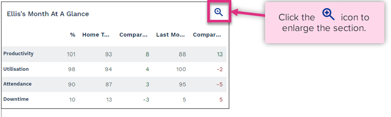

Key Measure
%
Home Team (%)
Compare to Team (%)
Last Month (%)
Compare to Last Month (%)
|
This section breaks down what Core Tasks the individual has worked on this month and compares it with their team.
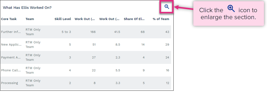

Core Task
Team
Skill Level
Work Out (Units)
Work Out (Hours)
Share of Team Members Work Out (%)
%of Team
|
This graph shows you how the individual's Productivity compares with the team, over the report month.


Team 25th Productivity
Team 75th Productivity
Team Productivity
Team Members Productivity (Home)
Team Members Productivity (Home and Borrowed)
|
This section illustrates provides a calendar view of the team members month and highlights changes to working pattern as well as highest and lowest performance days.


Productivity (Highest)
Productivity (Lowest)
Downtime
Overtime / Flexitime
Loaned
Non-Working Day
|


This chart illustrates the productivity achieved by the team member for each day of the week. It allows you to identify if there are any performance trends where the weekday may be having an impact.


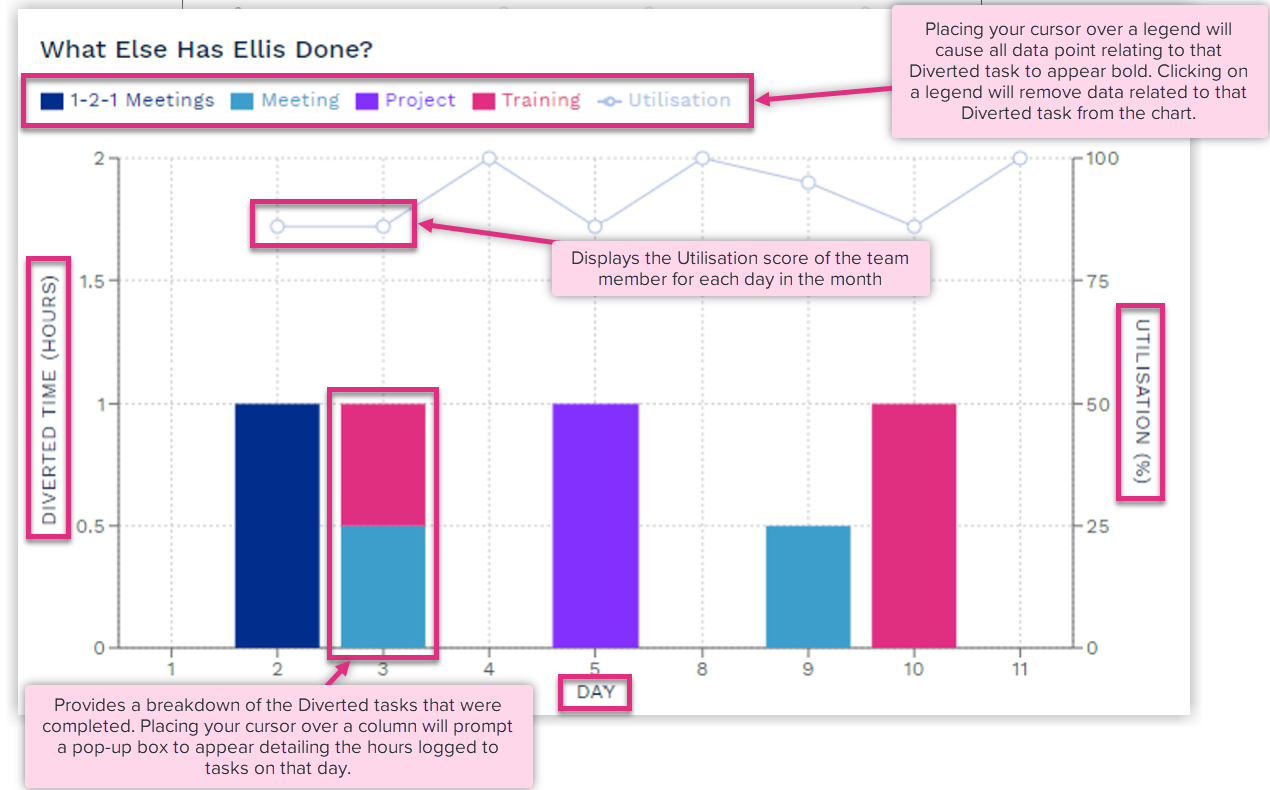
This section illustrates the team members utilisation for each day of the month as well as the Diverted tasks that they invested time in that drove their utilisation score.

This graph shows the team members Productivity over the last 12 months. The pink dots represent the productivity values achieved within that month. The larger the dot the more times that productivity value has been achieved.


This chart illustrates the team members Utilisation by month for the past 12 months. The values are based on the total Time Worked and the Total Core time captured in each month. This can help you to review how much time an individual is getting for important development and well-being activities throughout the year


This graph shows the individual's Attendance and Downtime for the last 12 months. Downtime includes things such as Annual Leave and Sick Leave. The attendance and downtime percentages are based on the total time recorded for the team member and how much of it was available to work versus how much was logged to a Downtime category.


This section shows you the team members Productivity and Utilisation when they were working for other teams as well as the amount of their total time worked that was spent supporting other teams.


| For more information on... | |
|---|---|
|
Calculations |
See Key Equations |
| Frequently Asked Questions | See FAQs |
| Notes | See Notes |


